For the past few months we have been working on several new client web design and development projects, two of which we launched last week. In many ways the sites could not be more different: one is for a small retail store, and the other for a law firm; one developed in Squarespace, the other in Wordpress.
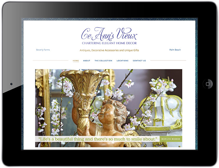
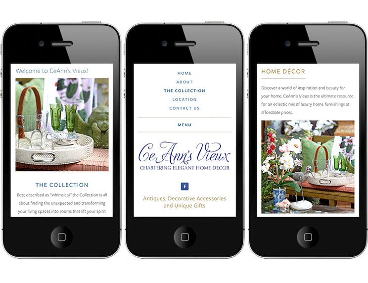
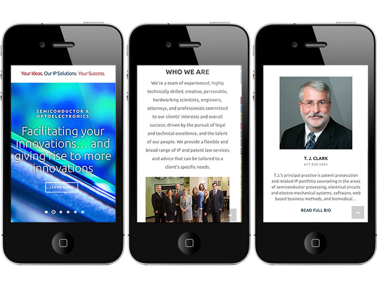
But in other ways they followed a similar approach. Both are in a widescreen and responsive, mobile-friendly format, with a minimalist design, and feature a home page slider with strong photography, and a clearly defined user-experience. Both demonstrate our attention to design and typographic details and our focus on content and visual branding; and both included commissioned and art directed photography sessions to develop strong visuals throughout the site.
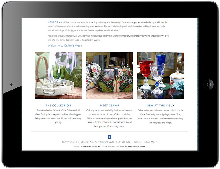
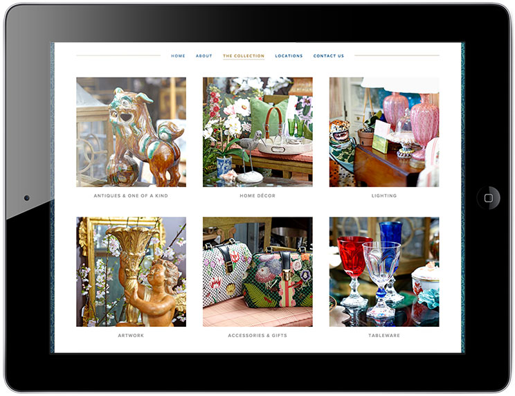
The first site was for a home furnishings store called Ce Ann's Vieux that was in the Beverly Farms section of Beverly, Massachusetts, (our home city) when we began the project, but has since relocated to Palm Beach, Florida. For this project we worked with local marketing company Communications Ink, who developed the copy and messaging strategy, and commissioned photographer Glenn Scott, who shot the wonderful images for the slider and galleries on location in the store.
The site was developed in Squarespace, a platform we love for smaller retail clients, primarily for the simplicity of its back end and hosting setup. While a bit more limited in the degree to which we can customize the design than the more robust Wordpress, the simplicity of the back end, and ease with which a site can be launched and maintained, we feel, far outweighs any limitations for this type of client. It also allows us to greatly reduce the development cost of a website, and lends itself well to this client's plans to later add an online storefront.
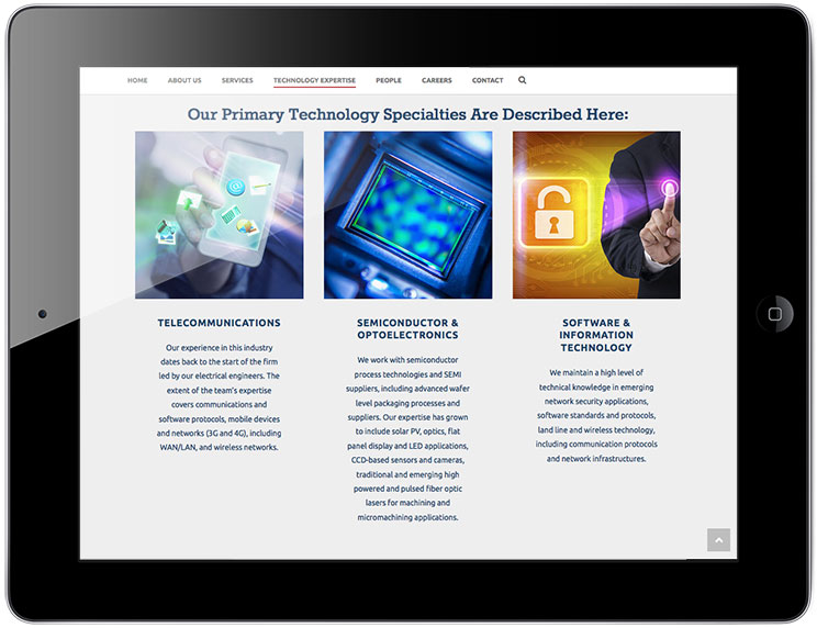
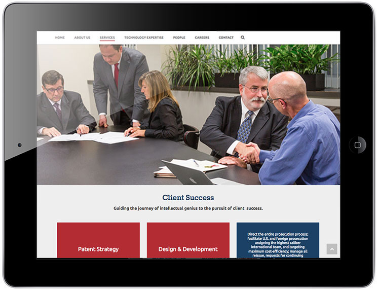
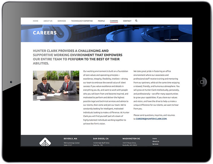
The second, and larger of the two projects was for the intellectual property law firm, Hunter Clark. For this project, we worked directly with the client's marketing team to help them visually execute their strategy which focused on the company's expertise within the high tech industry.
We began this project with a "discovery phase," which is our preferred method for beginning any new web project. This approach allows us to get to know a client's business focus, understand the desired message and functionality requirements, and explore design and site structure ideas in a static environment, before committing to any specific development process or platform. It gives both us and the client a good blueprint of the site's design and technology requirements, and allows us to determine whether we can build the site inhouse, and in what platform; or whether we contract with outside developers.
Once we completed this stage, and were reasonably clear on the site's UX design, we determined that the site was within our inhouse capabilities to develop, but that it required the more robust Wordpress platform (rather than the simpler Squarespace), and selected the Jupiter Theme from Artbees as the site's underlying theme. Of the many custom themes we explored, Jupiter seemed to align best with our initial design comps, and offered some additional bells and whistles such as flipboxes, and a employee custom post type structure that we felt would be an added benefit to the final site.
For site imagery, we sourced stock technology images for the slider, and commissioned local photographer Alyse Gause to do a custom photo shoot at the company's Beverly office to secure new company portraits; group photos of the full staff; and office environment photographs of the legal team working with clients.
We feel that these two sites taken together are good examples of our custom approach to web design for small to midsize jobs, and greatly expand our inhouse development portfolio. To read more about our web design services and see more examples of our work, see the web design section if this site.
