
This week we launched our newest client website, a Wordpress-based site for the Solomon Foundation, a planner and developer of urban greenway projects throughout Greater Boston.
The website was the largest and most comprehensive web project yet that we developed fully inhouse. From the initial discovery stage, through UX, wireframing, visual design, and buildout, we handled this project from soup to nuts over the course of a year-long development process.

The old Solomon Foundation website was overly text-heavy, non-responsive, and hadn’t been updated in years because it was hard coded and the client didn’t have the ability to edit it themselves.
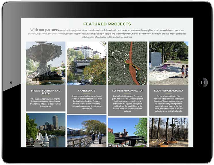
The Foundation specializes in making urban greenway projects happen by connecting a variety of public and private partners and funding sources. They wanted the new site to highlight the wide-variety of projects they have been involved in with a portfolio format that was sortable by status—whether completed; in development; or in the concept stage.
Their old site also featured projects, but in a very old school, overly text-heavy manner. It was not mobile-friendly, and was built as a static site, so couldn’t be updated by the client, and therefore was woefully out of date.
We first worked with the client on a discovery stage: listening to their vision; developing a wireframe and UX plan; and prototyping the site using Adobe XD. This was our first use of the Adobe prototyping tool, but as longtime users of Adobe’s print design products, was a natural progression.
We had initially considered both Squarespace and Wordpress platforms, both of which we work in. But in discovery, it quickly became clear that the site would need the more robust functionality and flexibility of Wordpress. We then researched a variety of premium themes, and tested a few with solid portfolio functionality, which we had determined would be the core functionality need of the site.

Our first stage Adobe XD prototype of the new site structure. We definitely plan to make XD an important part of our process going forward.
One of the benefits of inhouse development is that we can be a little looser with the design comps than in the old days when we would need to create pixel perfect comps of every page to hand off to a developer. We can also continue to evolve the design throughout the process in a live environment, and tweak all the details ourselves, rather than try to communicate design details to an outside developer who may have limited design sense. While there are some tradeoffs to this process, we make sure to do a lot of research upfront to find just the right starting theme for a particular project, and heavily customize it to our needs. This process creates a much more flexible, cost-effective workflow, and the client can see the site evolve live, as it will look in reality.
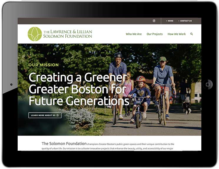
The site follows our general style of clean, no-nonsense design with strong imagery. We value content and smart user-experience over trendy effects.
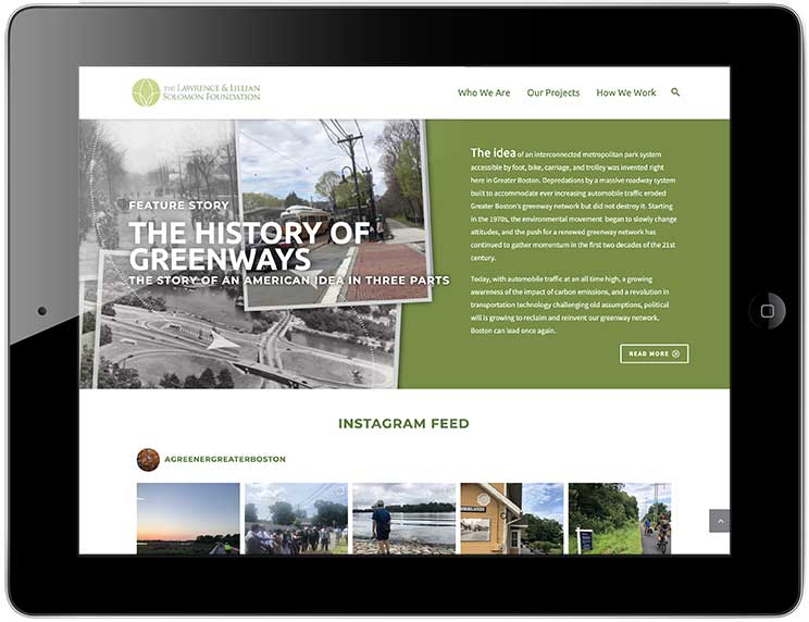
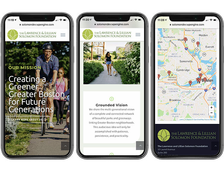
We see a website’s home page as a summary of what the organization is, what it does, and what’s new. Without venturing past the home page, a visitor should have a pretty good sense what the site is about. So the Solomon home page features a brief intro about the organization; a featured projects grid; a section summarizing their process; a feature on the history of greenways; and an instagram feed. There are multiple options to jump deeper into the site based on a user’s purpose for being there. Each of the major segments link out to the relevant page and echo the top level navigation. The design of the page is modular, and easy to evolve over time. New features (for news, events, though leadership topics, etc.) are planned to be added in the future.

The project map view on an iPhone. Users can click on any project, read a summary, link back to the corresponding project page, or get directions to visit the project in person.
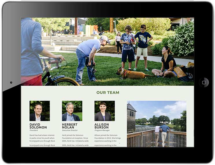
Similarly, there are longer, segmented pages for who we are and how we work that cover other organization information such as staff bios, values, history and partnerships. We prefer an approach that uses a more compact main navigation, with fewer, but longer pages of segmented information rather than an overly complex navigation with separate pages for every category. We are advocates of scrolling over clicking—especially for sites that are more about engaging the visitor than converting sales. But we go to great lengths to organize the information carefully and create intra-page navigation on each of these longer pages, and also provide a comprehensive footer index.
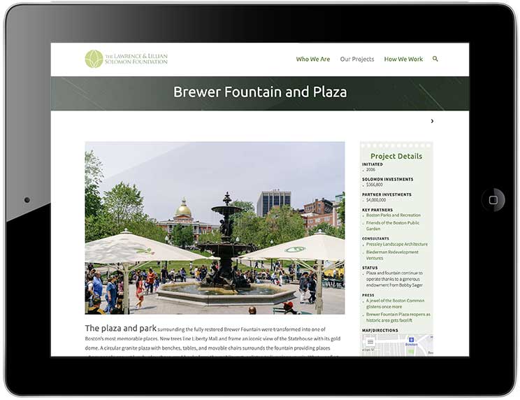
The meat of the site, however, is under our projects, which is built on a portfolio structure. We aimed to give the visitor a variety of options to navigate this section. They can go directly to any project from any page in the site from the upper navigation. They can go to the visual index page that shows a thumbnail and brief description of every project, sortable by status in a masonry-style grid. They can toggle to the map view, where all projects are plotted on a map, with a link back to each project’s page. Or they can scroll through all the project pages linearly.
The pages themselves balance visuals with a detailed narrative. The client wanted this part of the site to be more than just a photo gallery of each project, but a real resource of details on how the project came to be, and the specifics of the Foundation’s involvement in it. Each project page includes a narrative about the project; a stat box with links to important documentation and press coverage; a development timeline; links to project partners; a lightbox gallery; and, where relevant, schematic drawings and videos.
And of course, the site is responsive, secure, and easily editable by the client. Its design and functionality aim to be equally as attractive and user friendly on a phone or tablet, as it is on a laptop or desktop computer.